ATOP Officially Launched the Brand-New Company’s LOGO
On basis of the SDGI’s acquisition which brings ATOP fund guarantee and various resources, ATOP has the opportunity not only to keep up with this technology revolution but also allows the company to reduce bottlenecks and risks in the later development to continue to expand ATOP and realize our dream of becoming a first-class company in this industry.
To achieve this goal, the company has developed a new and ambitious strategy which also includes a complete rebranding of the company. This will result in a new brand identity and a new way of communicating on all platforms, which has officially?been?revealed in Jan. 8th,?2020. With the new brand strategy ATOP aims at a stronger market position and a much more involving way of communicating with both existing and potential clients.

What does the new “ATOP” represent?
?
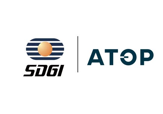
The brandmark is symbol of ATOP’s identity and an important signal to the market about who we are and what we do.
The letter “O” describes a circle, a universal symbol with extensive meaning. It represents?the notions of totality, wholeness, original perfection and is one of the oldest and most powerful symbols.
- Symbolizing the ongoing initiation and continuation of things – nothing is static.
- The circle also describes a 360-degree view of things. Looking outwards in all directions. Taking -in inputs from all directions.
- The rounded shape tends to send a positive emotional message of harmony and protection. The circle is often used in a logo to represent unity, commitment, love or community.

The modification of the “O” signals
- A movement from left to right. Left to right in western philosophy means moving forward.Thus the ATOP “O”’s modification signals a momentum, moving forward. Both the company ATOP and the solutions, engagement, partnerships.
- A symbolic translation of binary language – Zero’s and One’s. Imagine moving the small “square” in and out of the circle, describing “connect” (in the circle”) and ”disconnect” (out of the circle).
- Solving a basic paradox: Describing a square from a circle. Only companies with an imaginative mindset can do so. As companies like these are some of the most attractive partners to work with because they can identify solutions that otherwise would not be possible.
- The modification has a “yin and yang” symbolism describing both the two sides of transceiving and balance.
?
Meanwhile, we also put forward a new corporate slogan: let’s make it personal, which highlights the core concept of ATOP’ s customer-orientation, and reflects our professional attitude to provide customers with unique and personalized services and create perfect solutions for each customer, helping customers stand out from the competition. Listening to what others think and serving what others need is not only our attitude towards customers, but also our attitude towards everyone in ATOP. We help each employee customize the career path that is most suitable for self-development. Through the progress of the enterprise, we can promote the improvement of the employees’ own quality, so that everyone can give full play to their advantages in ATOP.
A brand new logo brings not only a change in brand image, but also a new attitude of ATOP?to customers and the optical communication industry. Thank you again for your support to ATOP. As our slogan says,“l(fā)et’s make it personal”, we will work with our customers and partners to create greater value with a brand new look and a high spirit.

Share this news
Related news


